This week I'm going to look at the impact of composition and color on the overall environment.
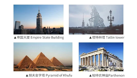
In the book Architecture and Level Design, the term "megastructure" is mentioned. What is a "mega building" First of all, people are the rulers of all things, people usually compare them in meters and decimeters, buildings beyond a certain scale will bring unspeakable fear, such as the pyramids, Parthenons and other giant buildings often bring people a sense of domination and conquest; The Rhea Lukaya Academy in Elden Ring - Megastructure is more of a Gothic building, so the overall style is taller and more thin, showing a strong mystery, mourning, and sublime mood. The interior focuses on academic and religious functions, with a typical cathedral-style chanting atrium and side aisles, while the soaring ceilings reflect pure reason. I think it's also possible to show the atmosphere that the scene wants to create through the shape and style of the building.

Similarly, the use of color is a great help for stage design.
First, it gives the construction a sense of space. In the game, the colors of the nearby grass and ground objects are bright and clear, and the scenery such as mountains and rivers in the distance is even darker and brighter. This is because colors and the like have the law of perspective change, which exists in the viewer's subconscious, and even if the cause of the change cannot be clearly expressed, it is possible to summarize such a change. Therefore, the color design gives the game a basic sense of space, making the game screen change from flat to three-dimensional. Of course, if you want to break through this rule, you can innovate on the premise of following the basic law, and flip the color changes of cold and warm light and dark. ([1] Liang Jinghong. Beijing:People's Posts and Telecommunications Press,2015,(13):15-20.)
The use of color can also create a play-oriented approach. As the game progresses, the concentration and dispersion of colors will guide the player's gaze, hinting at their location with prominent colors that will guide them to the next stage. Some games use a lot of unsaturated grays and blacks to create a sense of oppression, and players will naturally move in the direction of the light; If you pair dark, intimidating colors with warm, bright colors, it's clear that players will move in the direction of light, a trend caused by the presence of biological effects. An example of a biological effect is that when red is seen, the red light is focused behind it, as if the lens becomes more prominent, stretching the viewer's center forward. This may explain why such a color, when placed next to a warm color such as blue, gives the impression of moving forward. This color design can be used to distinguish important environments and components in the game. ([2] Pan Zhangmin, Zhang Xi. Analysis of the Application of High Water Permeability Color in Film1.Han Culture, 2018, 11.)
For example, the prayer flags I painted in Tibet last week are represented by five colors:
The five colors of the Tibetan prayer flags symbolize the five phenomena.
● "Yellow" represents "the noble temperament of the earth and the royal family"
● "Blue" stands for "Blue Sky, Strength and Vajra Bodhisattva"
● "Red" for "Sun, Compassion and Guanyin Bodhisattva"
● "White" for "white clouds and corals"
● "Green" stands for "Jungle, Wisdom and Manjushri"
When the world of infectious diseases is peaceful and the wind and rain are smooth, the world is peaceful, peaceful, happy and happy; When infectious diseases occur, there are many disasters in the world, and there is no peace. People who have lived on the plateau for generations are extremely sensitive to changes in nature. Peace and happiness in the world should first of all hope that the teacher will be free from disaster, so the five different colored flags on the prayer flags are used to represent this psychological shackles.
According to the feeling brought by the color, I simply filled in the painting "Zhangjia Ancient Building". Although this building is traditional Chinese architecture, I hope it is different from the brownish-red color of ancient Chinese buildings. The building has been abandoned for many years in the middle of a mountain valley, and there are many mechanisms inside, so I prefer to design it as a bronze building rather than a wood building. The whole thing had to feel bleak and scary, so I used large chunks of dark green.
The hovering dragon and the Buddha head on the roofI used a very bright gold color to guide the player to the target (as it was dark around)
This part is for the player to enter the mountain and walk to the front of the building, and the building cannot be seen from the outside of the mountain, for the appearance I designed it like this:
The use of almost colors to express a relaxed mood, a beam of sparks to form the "Tyndall effect", giving the player a sense of relief, feeling like jumping out of the tension just now.
Finally, I went out from the cave and climbed back to the snow-capped mountain, which is a very peaceful Tibetan residential area:


Comments
Post a Comment